

Before the crunch, the chew or the first waft of aroma, we eat with our eyes.
In the bakery and snack sectors – where competition is fierce and impulse-buying rules – colour is more than aesthetic: it’s a critical sensory signal and a strategic marketing lever. The visual cues from colour suggest flavour, freshness, indulgence, even nutritional value.
According to the Institute for Color Research, people form a subconscious judgment about a product within 90 seconds of viewing it and up to 90% of that decision is based on colour alone. Colour also increases brand recognition by up to 80% and can boost advertising comprehension and retention by over 70%, according to colour strategy consultancy Colorcom.
Colour perception begins in the retina, but interpretation happens in the brain, drawing from evolutionary instincts, cultural codes and learned associations.
Red stimulates appetite and urgency. Yellow is linked to optimism and approachability. Brown denotes richness and comfort. Green telegraphs health and freshness. Blue – unless used with intent – tends to suppress appetite.
Trump’s gold rush
US President Donald Trump’s obsession with gold is unmistakable: gilded hotel façades, gold-plated jet seatbelts, silk-lined walls, a Mar-a-Lago that glows like Versailles and even his recently announced Golden Dome for the US. Gold is his brand.
But what does it signal? “It gives wealthy people a sense of security,” colour psychologist and Colorcom director Jill Morton told Marie Claire. “It’s a kind of security blanket.”
Historically linked to royalty and opulence, gold once screamed power. Now not so much. “To younger consumers - Gen Z, Millennials - it reads as tacky, old-school, even harsh,” Morton added. In today’s clean label era, Trump’s Midas touch feels more museum piece than modern luxury.
By contrast, bakery and snack brands using gold are often tapping into something softer: nostalgia and timeless indulgence. Rold Gold, Stella D’oro ('star of gold') and even Sunshine’s Shokupan Gold use golden tones to signal classic quality, tradition and understated elegance - far from the glitzy bravado of a Manhattan penthouse.
Yes, brands thrive on signature colours (Coca-Cola red, Starbucks green) but Trump gold? It’s less status symbol, more faded glitz. The gold standard, perhaps, but starting to tarnish.
How colour cranks up cravings

Snack aisles function like mood boards. Bright red packaging is designed to incite action – think Takis, Doritos and Hot Cheetos. Yellow evokes cheerfulness and energy, making it ideal for family-friendly snacks like Twinkies, Minions-themed Hostess Cakes or Lay’s Classic. Green suggests plant-based purity or clean label health, seen on brands like Hippeas, Nature’s Bakery and Lärabar’s Organic range. Brown is often used in Bobo’s Oat Bars, Clif Bar and Dave’s Killer Bread to signal rustic indulgence and wholegrain goodness.
Research published in the International Journal of Gastronomy and Food Science (March 2025) confirms that colour choice influences emotional perception of brands. Analysing over 30,000 consumer reviews, the Turkish researchers found red correlated with passion; yellow with happiness; and blue with sadness or serenity. The findings underscore how brands should align product hue with intended emotional tone.
When colour goes right and wrong
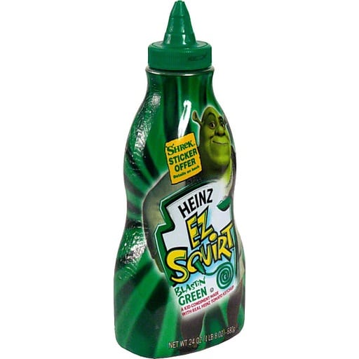
Few examples rival Heinz’s launch of Shrek-inspired green ketchup in 2000. The novelty hue triggered mass appeal among children, selling 10 million bottles in seven months and driving $23 million in sales. Though it tasted identical to regular ketchup, the unexpected colour made it feel new, fun and shareable.
More recently, General Mills’ Galaxy Dunkaroos featured neon purple and blue icing, tapping into 90s nostalgia and space-themed trends. Frito-Lay’s Flavor Swap campaign played with limited time colour tweaks like black corn chips and ‘mystery flavour’ bags with gradient ombre packaging – designed to fuel curiosity and impulse purchase.

But colour misfires are just as powerful. A dull red velvet cupcake that looks more beige than bold or a birthday cookie with uneven frosting can make a product feel stale or low quality. A streaky pink Pop-Tart or discoloured chocolate chips in a granola bar can signal age, poor storage or formulation shortcuts.
Colour mismatches can even override flavour. When hue and expectation don’t align – say, a green-frosted cinnamon roll or a vanilla cookie with grey icing – shoppers question freshness and safety. The result: lost trust, and often, lost sales.
Selling the flavour before the first bite

Most bakery goods and snacks are impulse buys. Consumers don’t have time to scrutinise ingredient panels. Packaging must instantly communicate indulgence, health or fun. That’s where colour is critical.
Bright, saturated packaging signals flavour intensity and excitement – common in sweets, crisps and seasonal treats. Earth tones and pastels communicate calm, hand-crafted quality – favoured by premium cookie and bread brands. Matte neutrals project minimalism and healthfulness, while darker colours like black and burgundy cue richness and luxury.
When packaging and product colour align, the message sticks. A beige protein bar in beige packaging? Clean and coherent. A blue energy bite in a lime-green pouch? Visually jarring.
The synergy with brand identity

Food is visual but so is branding. And the best-performing brands understand how to unify these disciplines.
For example, Tate’s Bake Shop reinforces its handmade positioning through forest green packaging and pale golden bakes. Hostess uses playful red and blue wrappers to suggest joy and nostalgia. RXBar’s minimalist palettes (beige, navy, black) signal ingredient transparency and wellness.
A study of emotion-based colour palettes in marketing - presented at the 2024 Joint 13th International Conference on Soft Computing and Intelligent Systems 25th International Symposium on Advanced Intelligent Systems (SCIS&ISIS) – analysed branding across 644 food companies. Its conclusion: emotional colour resonance (where hues match the sentiment of the brand) directly boosts consumer favourability. That’s why seasonal variants (like pastel cupcakes in spring or pumpkin-hued treats in autumn) outperform year-round SKUs by up to 25%, according to Nielsen.
Colour, then, becomes a tool for timing, emotion and behaviour shaping. It helps marketers tap into cultural rhythms and reinforce value propositions – before the packaging is even opened.
The natural vs synthetic dilemma

The recent uproar over artificial food dyes – fuelled by shifting regulations and growing consumer backlash – has transformed colour reformulation into one of the most urgent challenges facing bakery and snack makers today.
With the FDA’s ban on Red Dye No 3 and increasing scrutiny of synthetic additives, manufacturers are being pushed to act fast; finding natural replacements that not only meet compliance but also live up to consumer expectations for visual impact, shelf life and price.
For decades, the industry leaned on synthetic dyes like Red 40, Yellow 5 and Blue 1 for their vibrancy, reliability and cost-effectiveness. But regulatory crackdowns – most recently in the US and long-standing in the EU and UK – have shifted the colour landscape dramatically.
Natural substitutes (beet juice for red, turmeric for yellow and spirulina for blue) are now in high demand. But they come with formulation challenges: they’re sensitive to heat, prone to pH shifts and often inconsistent in tone. They also tend to be more expensive and have shorter shelf lives.
Renee Leber, manager of Food Science and Technical Services at the Institute of Food Technologists (IFT), told Bakery&Snacks, “The more vibrantly coloured the product, the more difficult achieving the same colour may be… [and] substituting synthetic colours tends to add cost, which can be a concern for many products that have specific price targets.”
In short: this isn’t just a technical swap: it’s a high stakes balancing act between compliance, creativity, and consumer confidence.
Future-proofing colour

Emerging tools are giving food developers more control than ever. Digital twin simulations allow teams to model how colour affects perception before production. Augmented reality (AR) previews help consumers see how packaging or glaze colour looks in real-world conditions.
Precision fermentation and biosynthesis are also on the rise. These technologies can generate colour compounds like anthocyanins or carotenoids in lab-controlled environments – offering stability, scalability and regulatory clarity.
As AI integrates deeper into marketing and NPD pipelines, colour decisions could soon be dynamically optimised by consumer mood data, regional trends or even TikTok virality.
Colour is no longer a garnish. It’s a strategic lever in product development, consumer psychology and brand loyalty. And as the regulatory landscape evolves and the demand for clean label intensifies, brands need to treat colour as a core component of product and packaging – one that can drive cravings, build trust and reinforce identity at every stage of the customer journey.
Cravings, afterall, don’t come in grayscale.
Studies:
Ayse Nur Songur Bozdag, Gizem Akkurt. (2025) Craving and colour: How do individual characteristics, food and tableware colours interact to influence food craving? International Journal of Gastronomy and Food Science, Volume 39, 101115. doi.org/10.1016/j.ijgfs.2025.101115.
M Shagyrov, P Shamoi. (2024). Color and Sentiment: A Study of Emotion-Based Color Palettes in Marketing. arXiv preprint arXiv:2407.16064.