Potato chips are among the many packaged snacks now being examined in labelling research, and the findings suggest that even in familiar, high-flavour categories, front-of-pack (FOP) warnings can influence consumer choices.
Building on previous studies focused on sugary drinks, the research indicates these labels may reduce purchase intent and sharpen awareness of nutritional content – particularly when they challenge what a consumer expects.
This adds a new layer to FOP labelling debates, which are becoming increasingly central to global food policy. While the latest evidence comes from Latin America, where warning labels are already mandatory in countries such as Chile and Mexico, similar systems are being adopted or considered in markets including Canada, Israel and parts of Asia, suggesting the region’s approach may have far wider influence.
Two studies conducted in Colombia by the same research team explored how nutrient warnings affect purchasing behaviour in the context of chips. The first, published in Appetite (available online on 5 July 2025), found the presence of front-of-pack nutrient warnings – black octagonal symbols now required in countries such as Chile, Mexico, Argentina, Colombia and Peru – led to a measurable decline in participants’ stated intention to buy chips.
These warnings, typically placed in the top left corner of the pack, appear on products that exceed thresholds for sodium, sugar, saturated fat or calories. In this case, labels reading ‘high in sodium’ or ‘excess saturated fat’ not only reduced stated likelihood of purchase but also improved recall of the specific nutritional information.

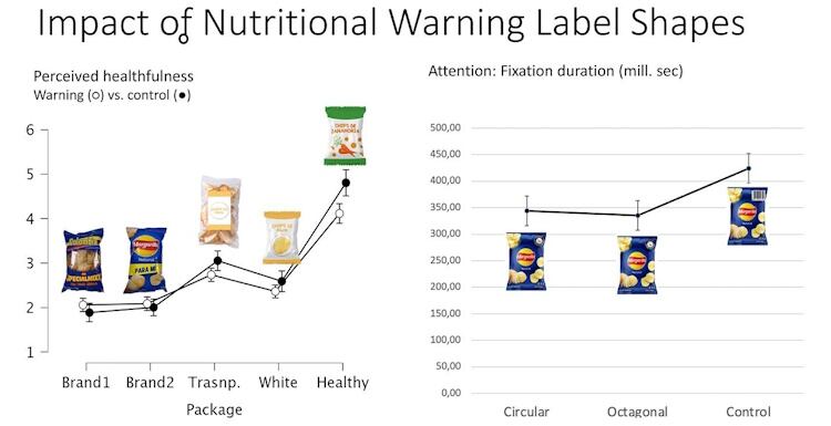
The effect varied depending on packaging. Researchers tested a range of visual presentations – including transparent bags; brands associated with wellness; and familiar mass-market designs – to understand how consumers responded. Labels had a more pronounced influence when paired with packaging that visually suggested nutritional or natural qualities. In those cases, participants expressed lower purchase intent and greater surprise, suggesting the label disrupted expectations.

In contrast, warnings on well-known branded chips were less likely to change perceptions. Gender also played a role, with women more responsive to perceived inconsistencies between packaging cues and the warning label.
How the chip test worked
To test the effect of packaging and warning design, researchers used five distinct chip presentations: two popular national brands, a transparent bag, a plain white pack and a health-positioned variant (carrot chips). Each version included prominent front-of-pack warning labels when applicable, such as ‘high in sodium’ or ‘excess saturated fat’, placed in the top-left corner. The study found that perceived healthfulness was most affected in the ‘healthy’ pack condition, where the warning conflicted with the product’s visual cues.
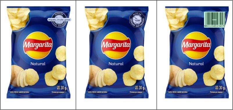
A follow-up experiment isolated the role of label shape – comparing circular and octagonal warnings on identical branded chip packs – and used a barcode in the same position as a neutral control. Interestingly, participants spent less time visually fixating on either warning shape compared to the barcode, suggesting that while the label’s presence can influence behaviour, it doesn’t necessarily draw attention in the same way. These visuals helped isolate how packaging cues and warning label design interact to shape perception and decisionmaking.
Shape doesn’t shift perception but context still counts
A second study – published earlier in the March edition of Food Research International by the same author – examined whether label shape had any bearing on consumer response. Researchers compared octagonal and circular versions of the warning to determine if visual form influenced perception or attention.
The difference was negligible – participants responded similarly to both shapes. In fact, eye-tracking analysis showed that participants spent more time looking at elements like the barcode than at the warning label itself.
However, as in the first study, labels were more influential when applied to snacks with health-oriented positioning, such as carrot chips, where they significantly lowered perceived healthfulness.
Together, the studies reinforce patterns seen in earlier labelling research. In Latin America, FOP warnings on sugary drinks have been credited with shifting consumer behaviour and encouraging reformulation. Chile, one of the earliest adopters, saw a more than 20% drop in sugar-sweetened beverage sales after labels were introduced. These results helped spark similar regulations across the region.

The latest findings suggest the same tools may also apply to other categories – including bakery and snacks – though their effectiveness depends heavily on the context in which the label appears.
For policymakers, the results suggest that FOP warnings are most effective when they disrupt expectations or draw attention to less obvious nutritional concerns. For manufacturers, especially those in markets considering similar regulation, the findings offer practical considerations. Product formulation, pack design and communication strategy may all need to evolve in response to changing labelling standards and consumer behaviour.
What brands can do
* Reformulate to stay below warning thresholds – where feasible – without compromising taste.
* Avoid pairing wellness cues or ‘natural’ aesthetics with a product likely to carry a warning.
* Use the back of the pack to contextualise ingredients or guide consumers via QR codes.
* Emphasise flavour, experience or novelty where appropriate – especially if warnings are expected.
* Track policy developments beyond Latin America: similar systems are being explored in Canada, Israel and parts of Asia.
Studies:
Ana M Arboleda AM. Impact of warning label shapes on perceived healthfulness and consumer attention, Food Research International (2025), Volume 205, 115917, ISSN 0963-9969, https://doi.org/10.1016/j.foodres.2025.115917.
Arboleda A. Clearly unhealthy: The effect of potato chips nutrient warning labels, Appetite (2025), 108214, ISSN 0195-6663, https://doi.org/10.1016/j.appet.2025.108214.


